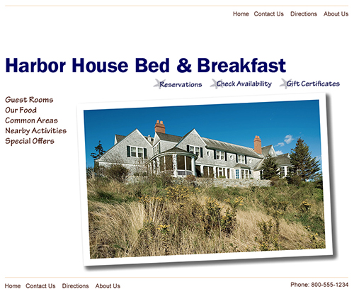
In the course of my work for About.com’s “Northwest US Travel” website, I have viewed thousands of websites for small hospitality businesses such as bed and breakfasts, tour operators, and recreation guides. Many are incredibly bad, with obnoxious music and animation, inconsistent navigation, and fluffy content. It seems like the worst of the worst fall into the bed and breakfast category. Consequently, in order to serve as an example of my strategic user-centered approach to visual and content design, I decided to take on the challenge of designing an optimal user experience for a bed and breakfast website.
Visual and Content Design Steps
- Define Site Objective
- Identify Primary User Profiles (Personas)
- Brainstorm and Card Sort
- Refine Information Architecture
- Design Screen Layout (Wireframe)
- Presentation Design
- Alternate Design
Define Site Objective
It is important to define the business goals, success metrics, and user needs/tasks at the beginning of the project. This usually requires some discussion and negotiation with the business owner/innkeeper, as they may require assistance in articulating solid goals and objectives. Technology, schedule, and budget resources and limitations must be considered. Once the primary tasks are identified, user flows can be developed concurrently with the below steps.
Business Goals with Success Metrics
- convert interest into reservations or gift certificates
(metric = reservations/unique visitor) - encourage repeat visits with content that will appeal to past guests, including testimonials, repeat guest deals, and recipes
(metric = repeat bookings)
User Tasks
- check prices and availability
- make reservations
- purchase gift certificates
Branding Goals
- accurately convey the ambiance and experience that guests can expect during a stay at the inn
Identify Primary User Profiles (Personas)
It is essential to identify the target audience early in the process. Towards this end, the definition of personas or user profiles is a helpful way to clarify assumptions and highlight factors that will influence the content strategy and UX design.
Professional Woman
- 40 to 55 years old
- college degree
- computer savvy
- native English speaker
- responsible for travel decisions and planning for household
- expects website to have a professional appearance that has many photographs and that conveys atmosphere at the B&B
Professional Man
- 30 to 45 years old
- college degree
- computer savvy
- native English speaker
- interested in practicalities such as food and bathrooms
- looking for a B&B that will set the stage for a romantic/intimate weekend
Brainstorm and Card Sort
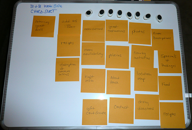
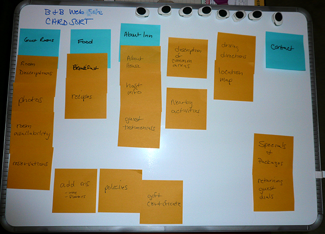
The next step in my UX design process is to brainstorm about the website content and functionality that the site users and the innkeepers want and need. The brainstorm results are then sorted, organized, and labelled. There are many different tools that can be used for this activity; I have used sticky notes for this particular demonstration. Ideally, this activity would include input from a variety of stakeholders and potential guests as well as from existing data sources.
Refine Information Architecture
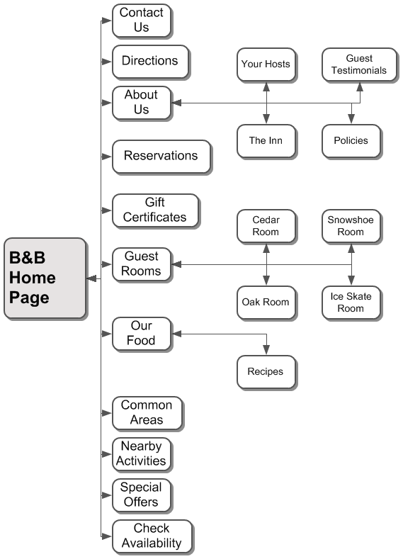
Once content requirements are defined and preliminary labeling assignments are made, the site’s information architecture (IA) can be developed and documented in order to guide site construction (both content and coding). Below are examples of the site’s organization and structure in both outline and flow chart format.
IA in Outline Format
Each bullet point represents a page on the web site.
B&B Home Page
- Contact Us
Phone number, mailing address, and general email contact form so that guests can ask questions or make comments. - Directions
Location address, driving directions, and map. - About Us
- The Inn
Information about history and architecture of the inn building. - Your Hosts
Bio and anecdotes about the inn hosts. - Policies
Details about inn policies to include check in/check out times, deposits, cancellations, pets, children, smoking, candles, groups, etc. - Guest Testimonials
Recommendations and praise from past guests. - Reservations
A form where people can make a reservation, which includes entering personal information and providing funds as a deposit. It will return a printable confirmation with unique confirmation # and also trigger an email. - Check Availability
A form where guests can input check in date and number of nights and find out room availability. - Gift Certificates
Information about and a form to order gift certificates for a future stay at the inn. - Guest Rooms
- Oak Room
Description and photos - Cedar Room
Description and photos - Ice Skate Room
Description and photos - Snowshoe Room
Description and photos - Our Food
Details about breakfast and the evening reception, with spotlight recipe. - Recipes
Ingredients and instructions for several of the breakfast and appetizers served at the inn. - Common Areas
Details and photos of breakfast room, library/game room, patio, and great room. - Nearby Activities
Highlight information about nearby visitor attractions and activities. - Special Offers
Details about special deals and packages, add-ons, and repeat guest deals.
IA Flow Chart
Navigation Structure/Labeling
Primary Links
The following links shall appear in both the header and the footer.
- Home
- About Us
- Directions
- Contact Us
Task Links
Persistent buttons or links that lead to each of the site’s interactive applications shall be grouped together and prominently placed in the site header.
- Reservations
- Check Availability
- Gift Certificates
Content Navigation
Buttons or links that drill down to the following site content shall be persistent on each page of the site. Presentation shall be in list format which, when active, will expand to show subtopics.
- Guest Rooms
- Our Food
- Common Areas
- Nearby Activities
- Special Offers
Supplemental Navigation
Since the depth of site content is minimal, breadcrumbs, search, or other supplemental navigation aids will not be required.
Design Screen Layout (Wireframe)
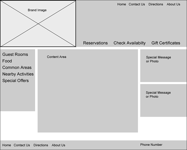
After the objectives, user profiles, high level tasks, information architecture, and navigation structure have been defined, it is time to design the basic screen layout. This design is documented in the form of a wireframe.
Presentation Design
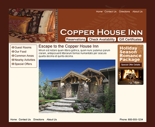
Using the wireframe as a guide, the visual presentation of site pages can be designed. In this case I used Photoshop to create nonfunctional mockups.

An Alternate Design
Here is an alternate visual presentation based on the same IA and wireframe.
